From Wikipedia, the free encyclopedia
Anscombe’s quartet comprises four datasets that have nearly identical simple descriptive statistics, yet appear very different when graphed. Each dataset consists of eleven (x,y) points. They were constructed in 1973 by the statistician Francis Anscombe to demonstrate both the importance of graphing data before analyzing it and the effect of outliers on statistical properties. He described the article as being intended to counter the impression among statisticians that “numerical calculations are exact, but graphs are rough.
The Anscombe dataset, which is found in the base R datasets packege, is handy for showing the importance of data visualization in data analysis. It consists of four datasets and each dataset consists of eleven (x,y) points.
The Four Data Sets
library(ggplot2)
library(dplyr)
library(reshape2)
##    x1 x2 x3 x4    y1   y2    y3    y4
## 1  10 10 10  8  8.04 9.14  7.46  6.58
## 2   8  8  8  8  6.95 8.14  6.77  5.76
## 3  13 13 13  8  7.58 8.74 12.74  7.71
## 4   9  9  9  8  8.81 8.77  7.11  8.84
## 5  11 11 11  8  8.33 9.26  7.81  8.47
## 6  14 14 14  8  9.96 8.10  8.84  7.04
## 7   6  6  6  8  7.24 6.13  6.08  5.25
## 8   4  4  4 19  4.26 3.10  5.39 12.50
## 9  12 12 12  8 10.84 9.13  8.15  5.56
## 10  7  7  7  8  4.82 7.26  6.42  7.91
## 11  5  5  5  8  5.68 4.74  5.73  6.89
Let’s massage the data to make the data more managable for analysis and plotting.
Create four groups: A, B, C D.
A=select(anscombe, x=x1,y=y1)
B=select(anscombe, x=x2,y=y2)
C=select(anscombe, x=x3,y=y3)
D=select(anscombe, x=x4,y=y4)
Now, let’s merge the four datasets.
alldata=rbind(A,B,C,D)  # merging all the four data sets
alldata[c(1,13,23,43),]  # showing sample
##     x    y group
## 1  10 8.04     A
## 13  8 8.14     B
## 23 10 7.46     C
## 43  8 7.91     D
Now let’s Compare their summary statistics
summaryStats =alldata%>%group_by(group)%>%summarize("Mean X"=mean(x),
                                       "Sample Variance X"=var(x),
                                       "Mean Y"=round(mean(y),2),
                                       "Sample Variance Y"=round(var(y),1),
                                       'Correlation between X and Y '=round(cor(x,y),2)
                                      )

models = alldata %>%
      group_by(group) %>%
      do(mod = lm(y ~ x, data = .)) %>%
      do(data.frame(var = names(coef(.$mod)),
                    coef = round(coef(.$mod),2),
                    group = .$group)) %>%
dcast(., group~var, value.var = "coef")

summaryStats_and_linear_fit = cbind(summaryStats, data_frame("Linear Regression" =
                                    paste0("Y = ",models$"(Intercept)"," + ",models$x,"X")))

summaryStats_and_linear_fit
## Group Mean X Sample Variance X Mean Y Sample Variance Y
## 1     A      9                11    7.5               4.1
## 2     B      9                11    7.5               4.1
## 3     C      9                11    7.5               4.1
## 4     D      9                11    7.5               4.1
## Correlation between X and Y  Linear Regression
## 1                         0.82      Y = 3 + 0.5X
## 2                         0.82      Y = 3 + 0.5X
## 3                         0.82      Y = 3 + 0.5X
## 4                         0.82      Y = 3 + 0.5X
If we look only at the simple summary statistics shown above, we would conclude that these four data sets are identical.
What if we plot the four data sets?
ggplot(alldata, aes(x = x,y = y)) + geom_point(shape = 21, colour = "black", fill = "grey", size = 3, alpha = 0.8) +
    ggtitle("Anscombe's Data Sets")+ geom_smooth(method = "lm", se = FALSE, color='blue') +
    facet_wrap(~group, scales="free")
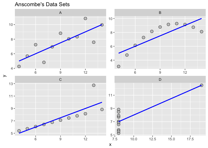
As we can see from the figures above, the datasets are very different from each other. The Anscombe’s quartet is a good example that shows that we have to visualize the relatonships, distributuions and outliers of our data and we should not rely only on simple statistics.